Apr 17, 2026
California Waterfowl Honors Its Past with Refreshed Pintail Logo
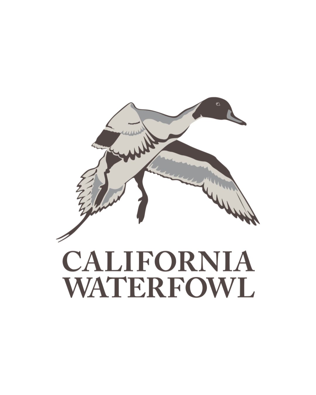
We love our pintail.
The northern pintail is an iconic California bird and has represented California Waterfowl for more than 80 years. If one bird defines our organization, it’s the pintail—and it always will.
The original design, inspired by Harry Adamson’s 1989 painting, is beautiful and detailed—but that level of detail created real challenges. With that in mind, we took a hard look at our logo and where it needed to evolve:
Versatility.
The original artwork captures every feather in stunning detail, but that complexity doesn’t translate well across all uses. Embroidery, engraving, and merchandise production often required costly workarounds or simplified versions that lacked consistency.
Recognition.
A strong logo needs to be instantly recognizable—even at small sizes or at a glance. Highly detailed designs lose clarity. Across the hunting and conservation space, organizations are simplifying their artwork for this very reason: to stay recognizable and memorable.
Digital Relevance.
In 1989, logos lived mostly in print. Today, they live everywhere—websites, social media, mobile screens. In those environments, simpler designs perform better and stand out more clearly.
Updating our logo was not something we considered lightly. Logos are symbols of identity that carry a lot of emotion, and we wanted to do right by our members. So, we approached this carefully and took several actions.
First, we solicited feedback throughout the process. Specifically, we reached out to several focus groups of California Waterfowl committee members, including both men and women, as well as younger and older individuals. We discussed what was important to them in a logo and shared several design ideas. Additionally, we also brought our fundraising field operations team into the huddle, since they interact with membership on a daily basis and are in many ways the voice of the members.
Second, based on what we heard from these stakeholders, we doubled down on what mattered most—our pintail. While opinions were diverse, a central theme was that members were still in love with the pintail, ideally in his current “cupping” pose. We found that an evolution of the current design, rather than a revolution, was in order. With that in mind, we sought to pay homage to the original Harry Adamson painting while updating the design slightly for the modern era, and to make the next generation of members feel at home.
Lastly, we worked with a creative partner who understood hunting and conservation. To help us design the updated logo, we worked with Gray Loon, an agency that has done outstanding work for clients across the outdoor, firearm, and conservation industries. When we reached out to them, it was a good sign that they called us from a cabin in the middle of a week-long elk hunt.
Where we landed was an evolution of the classic pintail logo that carries his legacy into the future. He’s there in all his winged glory, with a slight glow-up that helps him shine in every context and medium.
You’ll begin seeing this updated logo across California Waterfowl moving forward as we retire the previous version. We ask that you join us in adopting the new design in your communications and committee materials. This will help us move forward as one team under one banner with one mission—protecting waterfowl hunting and conservation in California.
![]()


